Read Time
min
SEO
Design
Aug 25, 2025
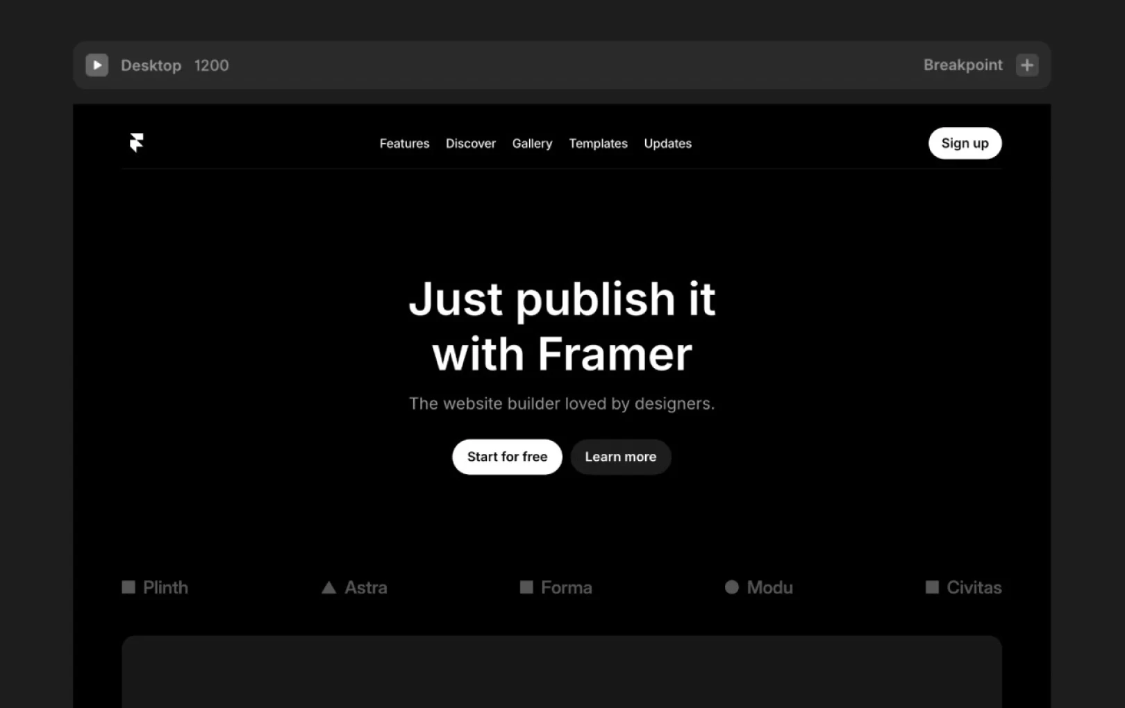
5 Strategies for Boosting Web Design Conversion Rates
Web design goes beyond just aesthetics; it's a powerful tool to boost conversion rates. Guide user journeys, optimize interactions, and create designs that consider performance to achieve tangible business results.


Contents
Table of Contents
What happens when a designer leads the entire process of creating a website? The gap between 'beautiful design' and 'high-conversion landing pages' disappears. By utilizing visual psychology, interaction design, and strategic thinking, you can guide users to naturally navigate through the site.
Design is a powerful tool that can transform a website. However, many designers remain focused only on creating 'beautiful designs,' separate from marketing outcomes. This often prevents designs from reaching their full potential when developers and marketers handle optimization separately. Conversion-driven design bridges this gap, enabling designers to lead the entire process from ideation to final launch.
Creating Layouts That Guide User Conversion Paths
It’s natural to be drawn to new UX trends or features as a designer, but trendy visual features can reduce conversion rates. Focus on designs that guide user conversion paths.
Follow the User's Path and Keep Only What’s Necessary
To design a user-centered layout, first understand the sequence in which users navigate the page. Identify the information they want, discomforts they feel, and questions they have through interviews, heatmaps, and click-path analysis.
Based on the points below, try organizing a logical flow.
Start with a clear value proposition
Present social proof with case studies or reviews
Pre-emptively address potential objections
Naturally lead to a Call to Action (CTA)
Guide User Actions with Visual Elements
Before you use color and contrast to highlight CTAs, it’s helpful to know the following.
There is no single "best" button color for conversion. While one study might recommend a red button and another a blue one, the contrast with the background is far more important.
Consistent color is more crucial than color psychology. Utilize your brand palette to apply the most striking and contrasting colors to CTAs and apply them consistently everywhere so users know what to choose easily.
Creating contrast doesn’t always mean using bright colors. Sometimes, it’s important to create space around key elements. White space can attract attention as powerfully as bright colors and is especially effective when used strategically to separate CTAs from other elements.
On landing pages, make sure that CTA buttons are visually prominent. If they are not visible, switch to high-contrast colors and add space around CTA buttons to prevent users from overlooking them.
Focus on Purpose When Conversion Rates Are Low
If conversion rates are low, you might wonder, "Is there a hidden solution to fix this?" However, the root cause may often be a lack of design purpose (not understanding what users want) or lack of persuasion (not convincing users why they should take certain actions).
UX designer David Kadavy said, "All the successful landing pages I’ve seen had one thing in common: It was visually very clear to users what the next desired action was." As such, it’s important to clearly define what you want from users and how to persuade them.
Utilizing Purposeful Interaction Strategically
Websites have numerous interactive elements, but not all positively impact conversion rates. In design centered on conversion, it’s vital that interactions aren’t simple decorations but genuinely assist users in their journey.
Focus on Micro Animations That Serve a Purpose
Good interaction design isn’t blatantly visible. It helps users achieve their objectives without drawing unnecessary attention. Each micro-interaction should have a clear purpose that can bring users closer to their desired actions.
Consider the following areas.
Emphasize elements that should drive key actions
Reduce perceived waiting times during loading
Provide immediate feedback based on user actions
Guide visitor attention to elements that need to drive important conversions
Confirm user input is received
Convert Passive Users into Active Participants
What’s the most indicative metric of conversion rates? While there are several good answers, one highly relevant metric is time spent on site. Users who stay longer on a site build trust, pose pre-sale queries, and better understand how a product/service addresses their issues.
Interactive components not only increase the time users spend on a site but also enhance the quality of that time by allowing users to experience the benefits of a product beyond just reading about them.
Consider ways to engage users through the following:
Replace static pricing tables with interactive ROI calculators
Turn general recommendations into personalized quizzes
Create interactive demos that allow users to experience the product in advance
Transform feature lists into interactive showcases
Implementing Responsive Designs for Conversion
Most "responsive" websites still treat mobile devices as secondary. Mobile design is more than shrinking text and elements or hiding a few things to fit on a desktop. This design approach overlooks the fundamental fact that users' goals and actions differ across devices.
Conversion-focused responsive design needs to adapt not only to screen sizes but also to user contexts. Achieving this requires prioritizing how people use the site across various devices.
Start with Mobile, But Optimize for Each Situation
While a mobile-first approach has been prioritized for years, many designers still misunderstand it. Instead of designing directly for small screens from the start, they adapt desktop experiences by removing elements to fit mobiles.
For mobile users, focus on these three key elements:
Prioritize designing for content that enhances conversion rates
Create tab elements large enough for easy one-hand interaction
Remove unnecessary steps from conversion processes
Every decision should consider the mobile environment. Keep in mind that users may become distracted while looking at the screen and typically navigate with one hand. Also, avoid designs that significantly impact loading times, considering various connection speeds.
Framer supports easy designing across multiple screen sizes through responsive font sizes and stack-based design adaptable to available devices. Additionally, you can preview all breakpoint designs in a single editor window, making it easy to add or remove elements to enhance device-specific experiences. With breakpoint inheritance features, any changes made to a base breakpoint are automatically applied to others.

Strategically Use Desktop Space
When users switch to desktop, there's more screen space, but don’t just try to fill it with content. Instead, utilize the expanded space to reduce friction between content that occurs during device-specific conversions.
Advantages of desktops include:
Ability to create multi-column layouts showing more options at once
Displaying additional information without extra clicks
Implementing sophisticated hover states to guide users
The goal of responsive design isn’t to create entirely different experiences for each device. Instead, strive to design in a way that makes conversions easier using the additional space.
Avoid Mistakes That Lower Conversion in Responsive Designs
When reviewing website designs in various responsive formats, be wary of the following common conversion-deterrents.
Don’t hide CTAs on mobile: If CTAs disappear below the fold, conversion rates drop.
Avoid complex form layouts: Forms that work on desktops might reduce conversion on mobiles. Remember that each additional field on a small screen exponentially increases user drop-off risks.
Avoid tiny fonts and buttons: If users have to zoom to read text or click payment buttons, conversion rates will quickly drop.
Don’t regard responsive design merely as technical architecture. Constantly think about user experience and aim for responsive transitions across all devices instead of simply making it "work" on different screens.
Considering Performance as Part of Design
Website performance isn't solely a developer's concern. Slow page load speeds can cause users to leave a site, often leading to reduced conversion rates. Designers can also contribute to optimizing performance.
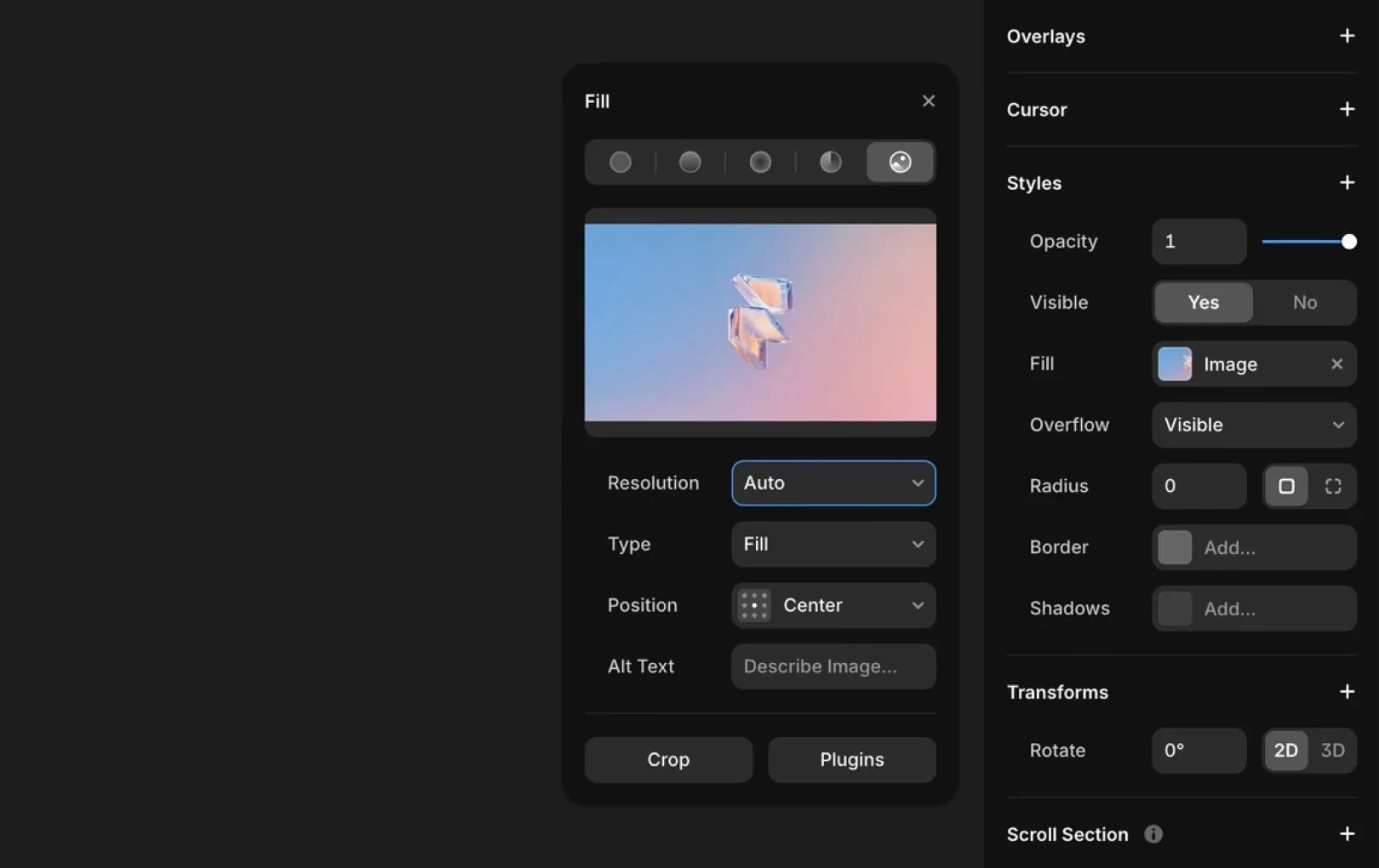
Image optimization: SVGs are suitable for icons and logos, JPEGs for photos, and PNGs for complex images requiring transparency. WebP offers efficient compression in modern browsers. Framer inherently reduces size through AVIF conversion, automatically providing device-optimized images.
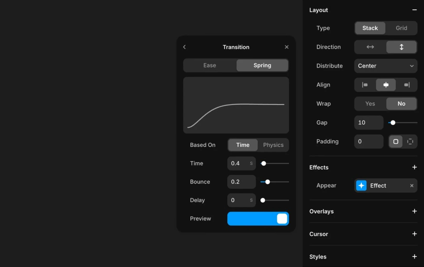
Animation optimization: Excessive animation can slow the site. Studies show a 100ms delay can lead to a conversion rate drop of up to 7%. Only apply light animations when necessary.
Component reuse: Component-based design maximizes browser caching benefits, improving revisit speeds. It also ensures a consistent user experience.
Most designers leave performance optimization to developers, but this is a mistake that lowers conversion rates. Slow loading pages lead users to leave. No matter how well-designed your conversion strategy is, you can't save a site users don’t have a chance to see.
Designers significantly impact outcomes through choices made early in the design process. Here are ways to make those choices more effective.
Optimize Images Without Quality Loss
Images comprise over half of the typical website’s weight. They’re also something many designers dislike compromising on. Here are ways to maximize performance without noticeable quality degradation.
Use SVGs for icons, logos, and simple illustrations
Choose JPEGs for photos and complex images without transparency.
Use PNGs only for complex images requiring transparency.
Try WebP for alternative compression features in modern browsers.
Framer handles image optimization automatically for convenience. Most images are transformed to the AVIF format for approximately 20% smaller sizes. Each image automatically resizes according to screen size and is served to browsers, while you can manually adjust image resolution in Framer's settings.
Use Lightweight Animations
Adding flashy animations can increase user engagement, but remember that if they slow down site speed, they can adversely affect conversion rates. Studies indicate a 100ms page loading delay can drop conversion rates by up to 7%.
Test performance before and after adding interactive elements to ensure it doesn't slow too much. If animations add over 100ms to load times, even the flashiest site may not enhance conversion.
Keep animations lightweight, but explore various loading animations that help reduce perceived loading time.
Build a Reusable Component System
Using component-based design can achieve both consistency and performance benefits. Reusing components effectively allows browsers to cache them, greatly improving returning visitor load times.
Instead of crafting unique designs for every page, consider an optimized component library, which is a more systematic approach. This reduces code waste, provides a denser user experience, and accelerates overall UX.
Continuous Improvement Based on Data
Many teams create a site and leave it as is, or make sporadic improvements based on intuition. However, conversion-focused design should continually evolve through a data-driven feedback loop.
Available data metrics include:
User path analysis: Identifying actions just before conversion or exit
Conversion by device: Checking if conversions drop in specific environments
Form field completion rates: Analyzing which input fields lead to user abandonment
CTA click rates: Ensuring the button is effective enough
Scroll depth: Verifying if essential content is actually read
Exit pages: Determining where users leave before converting
No-code platforms like Framer allow for quick A/B test iterations, enabling real-time data-driven improvements. When refining, it’s crucial to prioritize impactful improvements.
Develop Design Based on Actual Data, Not Assumptions
Most teams design and launch a site and move on to the next project. Some occasionally tweak it but rely on intuition, subjective opinions, or voices from the most outspoken members. Both approaches are costly.
To establish a feedback loop for continuous site improvement, setting a data-based design strategy is crucial. Focus on the following signs of friction during the conversion process.
Path analysis: Shows the exact path users took before converting or exiting.
Conversion rate by device: Indicates whether responsive design fails on specific screens.
Form field completion rates: Monitors whether users completed specific fields or abandoned them, identifying which fields cause exits.
Click-through rates on CTAs: Determines if the main CTA button is effective.
Scroll depth: Reveals whether important content is visible during scrolling.
Exit page analysis: Analyzes exit pages to determine where users leave the site.
Time to first interaction: Measures the time until initial interaction, indicating user understanding of actions required.

Using a no-code design platform allows faster iteration without waiting for developers to A/B test. Instead of evolving conversion optimization in sprints, continuously improve based on actual user data to achieve complex outcomes within conversion rates over time.
Remember that not all changes yield equal results, so prioritize changes that are likely to significantly impact conversion rates.
Turn Design into a Conversion Weapon
Beyond creating attractive sites, focus on designing sites that translate into business outcomes. When designers lead the entire production process, they can merge creativity with strategy, becoming a competitive edge.
Practice and create conversion-focused websites using Framer. Start quickly, keep improving, and achieve tangible results.
This post is a translated and adapted content of Framer's official blog ‘5 conversion-driven web design tactics to boost your website’s ROI’.
More posts


