Read Time
min
Performance
Aug 21, 2025
How to Design a Responsive Website Without Code
With Framer, you can easily design responsive websites without code, offering seamless user experiences on all devices through intuitive wireframing and automatic breakpoint settings.


Contents
Table of Contents
The days of pinching, zooming, and horizontal scrolling on mobile devices are over. Today, users expect a seamless experience on mobile. This article shows how Framer provides a perfect user experience without code changes.
The Evolution of Responsive Design
Responsive web design refers to websites that automatically adjust to any device or browser. Whether using a smartphone or a desktop computer, customers can have a consistent experience.
In the early days of responsive design, web designers would start with a desktop version and adjust the design for mobile and tablets. While using breakpoints for desktop, mobile, and tablet remains essential, the variety of device types today makes designing for every resolution practically impossible.
In 2018, the most common resolution (360x640) was used by 23% of users, but now no single resolution holds more than 8% of the market share.
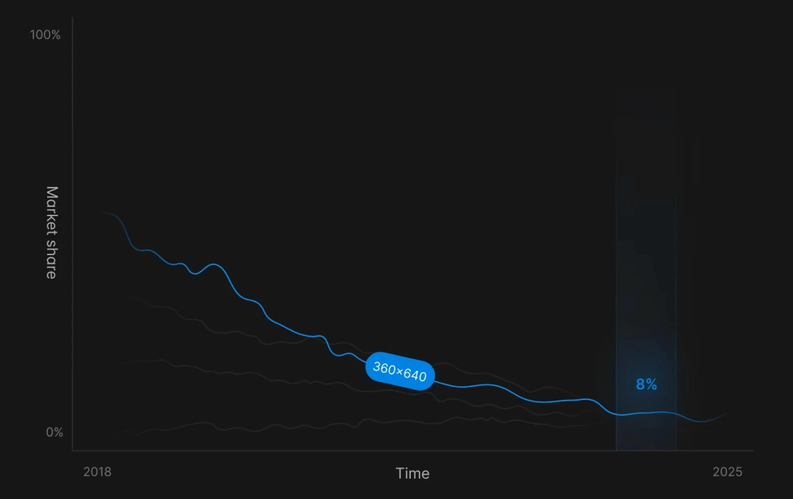
Source: Statcounter
Automatically resizing using stacks is one alternative. By converting designs into stacks, layouts automatically adapt to changes without needing manual breakpoint adjustments. Tools like fluid grid layouts, relative positioning, responsive images, and typography are suitable for this environment.
Creating Responsive Websites with Framer
Discover the various features that Framer offers to make implementing responsive designs more intuitive.
1. Start with Wireframes
Creating wireframes in Framer is different from traditional design tools. Instead of creating mockup frames that need to be rebuilt for different screen sizes, components in Framer are built to be responsive from the start. The platform’s component library offers pre-built elements that adapt automatically to different screen sizes.
Navigation automatically converts to suit mobile view
Hero sections automatically adjust to screen size
Content blocks rearrange according to available space
When building wireframes, consider the following aspects:
Keep navigation simple and intuitive
Consider what users should see first and focus on content hierarchy
Think about how elements stack and rearrange on smaller screens
Use Framer’s built-in components to speed up the process
It’s good to start with basic content blocks and gradually increase complexity. This way, you can focus on the design’s structure and hierarchy without getting bogged down by technical details. Additionally, since navigation differs greatly between mobile and desktop, it’s recommended to use Framer to easily create multiple versions for different screen sizes.
2. Set Breakpoints
Breakpoints are crucial in responsive design. However, as anyone who has worked with CSS media queries knows, breakpoints can be tricky. What looks fine at exactly 768px might break at 767px or 769px.
Framer can turn this technical process into an intuitive and visual experience. With Framer’s breakpoint editor, you can drag handles to set breakpoints and see changes in real time. Framer’s responsive preview mode also lets you instantly see how your design looks on various screen sizes.
One of Framer’s most powerful features is the automatic application of changes when breakpoints are altered. Here's how it works: when you change the base layout, those changes automatically apply to other screen sizes, greatly reducing repetitive tasks.

3. Mobile-First Approach
With mobile traffic making up 61% of web traffic, designing for desktop first no longer makes sense. Instead, it’s better to design for mobile first and adjust for desktop later. Designing for small screens requires strategic decision-making from the beginning due to limited space.
With Framer, you can easily set mobile as the base layout and progressively enhance the design for larger screens. Consider the following:
Extend single-column layouts into multiple columns
Display additional content on larger screens
Add more sophisticated interactions for desktop users
Convert mobile navigation to be more desktop-friendly
Adjust typography sizes per screen to improve readability
Optimize image layout and cropping for various screen sizes
Navigation in mobile responsive design is one of the most challenging parts, but Framer makes it easy to manage. Mobile patterns like hamburger menus or bottom navigation bars can be seamlessly implemented as full menus on desktop, while maintaining brand consistency and user experience.

4. Creating Fluid Grid Layouts
Framer's Grid feature provides an intuitive approach to a responsive grid system. By leveraging auto layout features, it automatically handles common responsive design issues like spacing, maintaining consistent gaps between elements, and proper alignment when adjusting layout sizes.
Using Framer’s grid system allows you to:
Specify the number of columns at different breakpoints
Adjust how elements span across columns
Manage element flow and sizing
Automatically adjust spacing
One of the most powerful features of Framer’s grid system is its ability to handle dynamic content, such as CMS collections, user-generated content, and dynamic images. When new items are uploaded, Framer’s grid system maintains the layout exactly as initially designed.
5. Utilizing Stacks and Relative Positioning
While grids take care of the overall page structure, Framer’s stacks manage how elements relate to each other within that structure. Stacks are intelligent containers that automatically handle spacing and alignment between elements. You can arrange elements horizontally (as rows) or vertically (as columns), and stacks maintain proper spacing even as the screen size changes.
The key is relative positioning. Instead of pinning elements to specific coordinates, stacks allow elements to adjust their position relative to their container and adjacent elements.
Common use cases for stacks include:
Navigation menus that transition smoothly between desktop and mobile
Card layouts that maintain consistent spacing regardless of content
Form interfaces that perfectly align inputs and labels
Content sections applying neatly to all screen sizes
The true power of stacks is unleashed when they are nested together. By combining horizontal and vertical stacks, you can create sophisticated layouts, with each stack having its own auto-layout properties like “container filling” and “content wrapping.” For more details on the difference between stacks and grids, check out Framer's Academy .
6. Optimizing Images and Typography
Framer’s approach to responsive images goes beyond simple resizing. Through lazy loading, it optimizes image delivery for performance, automatically generates responsive image source sets, and uses smart cropping tools to focus on key areas when resizing images.
Framer provides tools to help images look great at any size with features like these:
Delivering appropriate sizes for different devices
Using SVG where possible for crisp scaling
Providing adjustable positions and sizes
Providing device-specific image sizes
Supporting sharp scaling with SVG use
Providing lazy loading and dynamic crop functions

Framer's typography system lets you manage font sizes, line heights, and spacing across various breakpoints. It also optimizes font loading to prevent layout shifts and maintains text readability even while custom fonts are loading.
To avoid issues related to responsive design, you can set fluid font sizes that expand smoothly. Additionally, activating minimum and maximum sizes ensures text doesn’t become too small or large. Use Framer's text-fitting capability to design eye-catching headers and paragraphs that adjust in size to fit the browser or section.
Responsive Testing Before Launch
Framer offers two powerful ways to test your site's responsiveness before launch.
Preview Mode: Use the built-in preview mode to check your design on different devices without leaving the editor. Instantly view various device environments within the editor.
Real Device Testing: Through Framer’s share link, conduct tests across various environments, including smartphones, tablets, and monitors. By working on designs on various devices, you can ensure everything functions as expected and catch bugs before going live with your new website.
Create Websites That Work Beautifully on All Screens
Responsive web design has become essential, and Framer offers tools to easily achieve it. Create websites that are flexible and scalable, not just static layouts.
Check out Framer's templates to start creating responsive designs. Visit the gallery to see responsive websites made by other users, and sign up for a free Framer account to start building responsive websites today.
This article is a translated and adapted version of ‘How to design responsive websites without code’ from Framer's official blog.
More posts


