Read Time
min
Insights
Aug 28, 2025
Framer Fit Text: Responsive Typography
Framer's 'Fit Text' feature automatically adjusts text size for smooth resizing, enabling efficient typography without complex CSS.


Contents
Table of Contents
Framer has launched a new feature called "Fit Text", which allows you to create titles that resize to fit any container. This feature supports multiple lines, inline formatting, and minimum/maximum widths, all while maintaining high performance.
Problem: CSS Limitations
We first looked at existing libraries, but there was a common issue: the need to measure the actual size of the text before rendering. However, the Framer site is statically generated and must be fully rendered in any browser before JavaScript is executed.
Next, we tried font-size: 100vw, which worked well for filling the entire screen. However, to fit text into arbitrary containers, you need a complex CSS calc expression that calculates the size of all parent elements in vw units. Although theoretically possible, it is practically difficult to apply because you cannot know the size of parent elements from within the component code.
Solution: SVG + viewBox + foreignObject
The next approach we found was utilizing SVG's viewBox and foreignObject. Rendering text as a foreignObject within SVG allows for scaling effects without issues with accessibility or SEO.
However, there is one condition: you must calculate the exact bounding box of the text and reflect it in the viewBox, continuously synchronizing it every time the text changes. Otherwise, the text will be cut off or misaligned. Therefore, this approach was practically impossible for the average user's site.
Automation: Framer's Handling
Framer has automated this process to solve the problem. By setting the text to “Fit”, Framer measures the text size at the current font size, calculates the bounding box, and generates the corresponding SVG and viewBox.
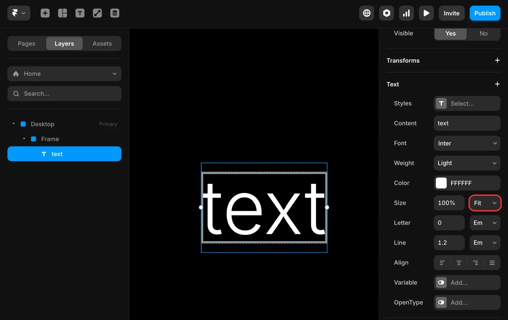
When a user edits the text, Framer reassesses it and updates the viewBox. While editing, it recalculates the viewBox in pixel units to provide a natural editing experience, and once done, it automatically adjusts the size based on the viewBox again. All of this happens smoothly without affecting canvas performance.
Result: Smooth Resizing
When the site is deployed, the viewBox is already calculated, so the text is rendered at the correct size even before JavaScript loads. Size is adjusted smoothly without flicker, resizing delays, or fade-in.
Future Challenges: Container Queries
When browsers support container queries more fully in the future, Framer plans to adopt them. You can use a common unit like cqw, which is based on the container, not the viewport, allowing components to work naturally without complex CSS calc().
Fit Text is a great example of Framer automating a challenging feature, allowing users to focus solely on site creation. We hope you create creative outcomes by utilizing this feature.
This article is adapted from Framer's official blog post, ‘Advanced responsive typography: technical implementation of Fit Text’.
More posts


