Read Time
min
Get Started
Jul 11, 2025
Framer Interface: Key Structure and Features
Framer's interface consists of a top toolbar, left sidebar, right sidebar, and canvas. Understanding the functions of each area can make the design process much more efficient.


Contents
Table of Contents
Main Areas of the Framer Interface
The Framer screen consists of the following four main areas.
Top Toolbar
Left Sidebar
Right Sidebar
Canvas
Top Toolbar
(1) Left Area of the Top Toolbar
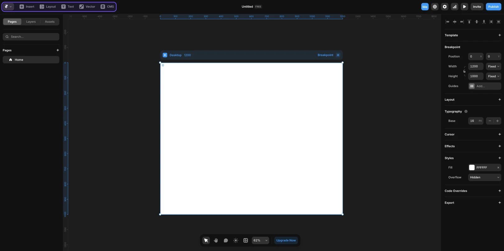
Name | Description |
|---|---|
Framer Logo Button |
|
Insert |
|
Layout |
|
Text |
|
Vector |
|
CMS |
|
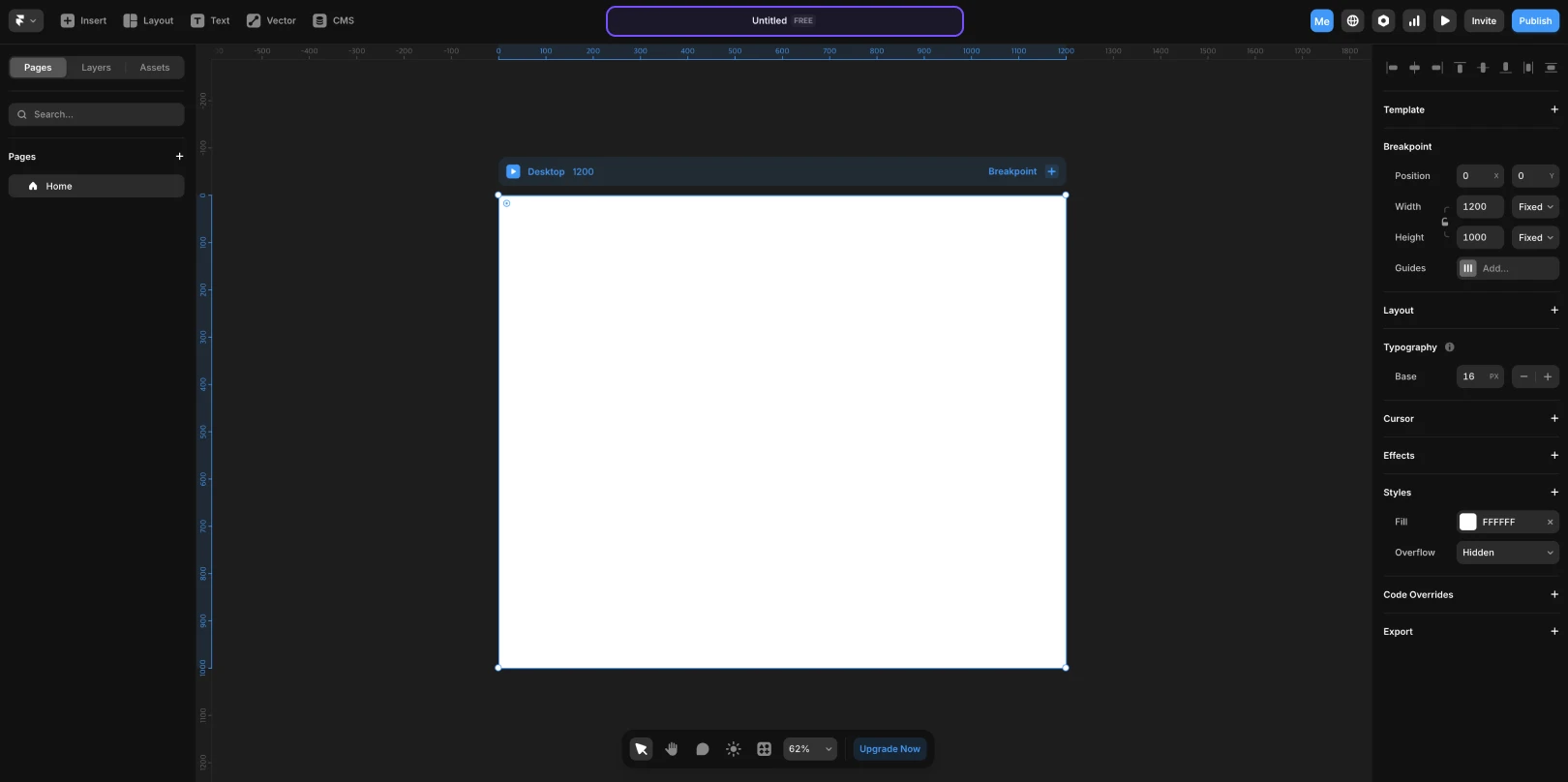
(2) Center Area of the Top Toolbar
Name | Description |
|---|---|
Project Name |
|
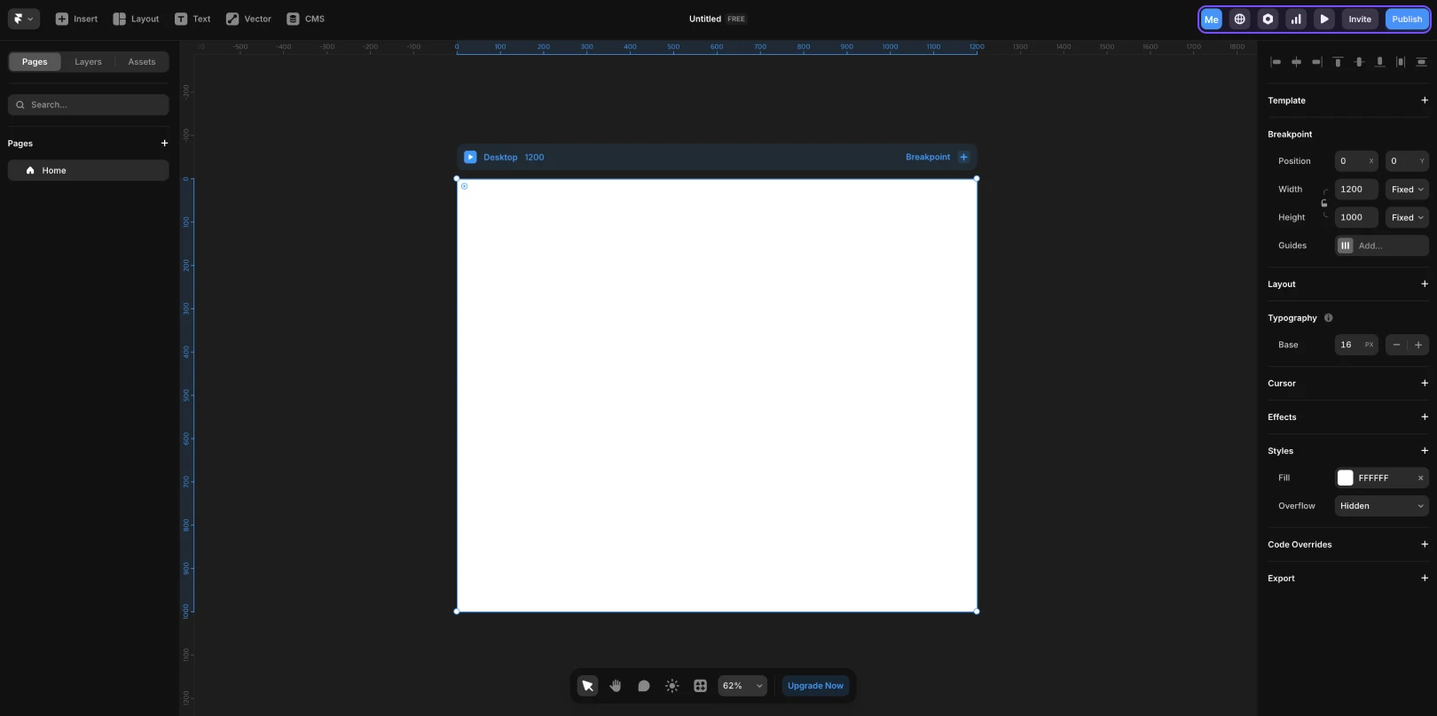
(3) Right Area of the Top Toolbar
Name | Description |
|---|---|
Collaborator Indicator |
|
Localization |
|
Settings |
|
Preview Mode |
|
Invite Button |
|
Publish Button |
|
Left Sidebar
The left sidebar is where you structurally manage pages or elements within a project. It has three tabs, allowing you to switch types as needed.
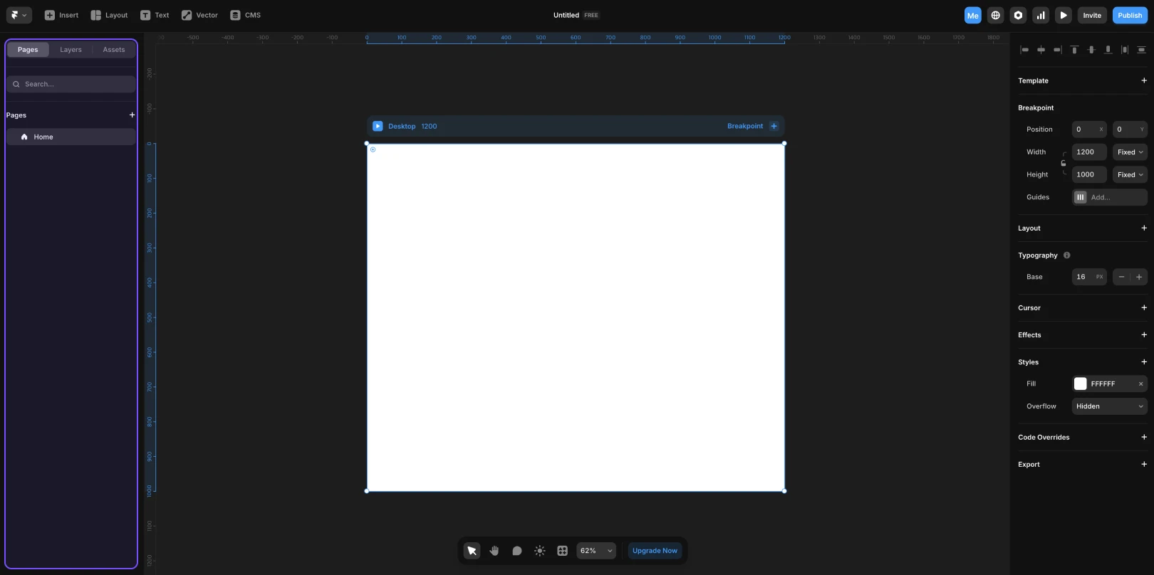
Name | Description |
|---|---|
Pages |
|
Layers |
|
Assets |
|
Right Sidebar
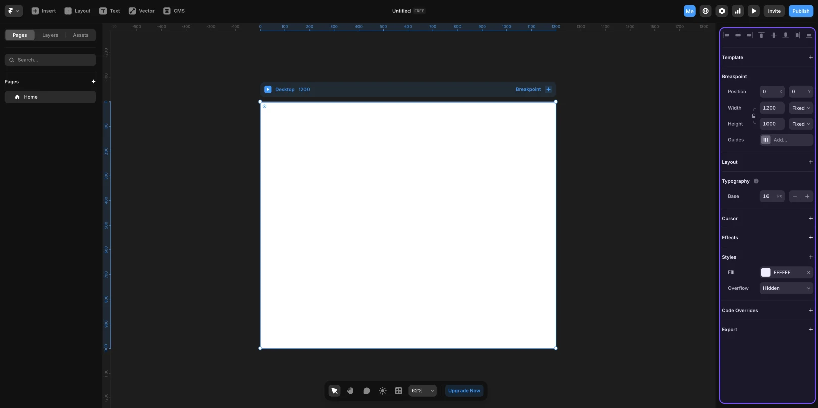
Name | Description |
|---|---|
Properties Panel |
|
Canvas
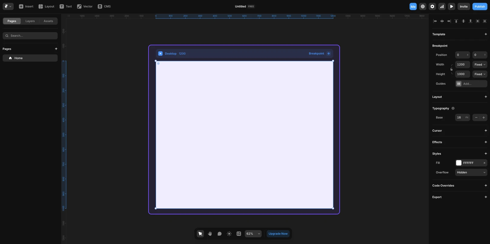
A space where designers arrange elements and directly design the visual structure. With infinite expandability, you can freely place elements without limitations.
Framer’s pages are always within a 'Breakpoint' frame. This Breakpoint sets the layout standard for responsive web design, allowing adjustments for various screen sizes such as desktop, tablet, and mobile.
To place an element on the canvas, select the desired item from the
Insertmenu, and drag it onto the canvas. You can see a live preview on the canvas and even simulate interactions directly.
(1) Tools at the Bottom of the Canvas
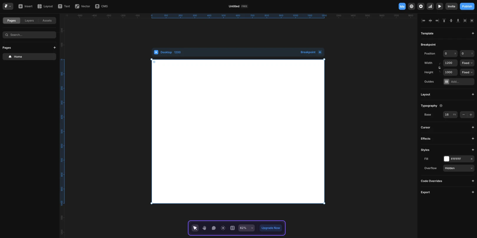
Tool Name | Function Description |
|---|---|
Pan Tool |
|
Comment Tool |
|
Day/Night Mode Switch |
|
Zoom Tool |
|
This article is translated and adapted from Framer's official YouTube video, ‘Getting familiar with the Framer interface (Fundamentals Lesson 1)’.
More posts


