Read Time
min
Design
Jul 7, 2025
How to Use Stacks and Responsive Layouts
A Stack is a special frame that automatically arranges child elements to create a responsive layout, allowing users to maintain a natural layout that adapts to content without manual placement. In this article, we'll explain more about Stacks.


Contents
Table of Contents
What is a Stack?
A Stack is a special frame that automatically arranges child elements horizontally or vertically.
It's similar to CSS's Flexbox or Figma's Auto Layout, making it excellent for content alignment and building responsive structures.
Benefits of Stack
No need for manual placement of elements
Automatically adjusts size and alignment based on content
Easy to implement responsive structures
Layouts remain natural even when text or images change
For example, if button text changes, the button width automatically adjusts, and if text within a card increases, the entire area expands naturally.
3 Ways to Create a Stack
Add Stack Properties to an Existing Frame
Select the frame and adjust
Layoutsettings on the right
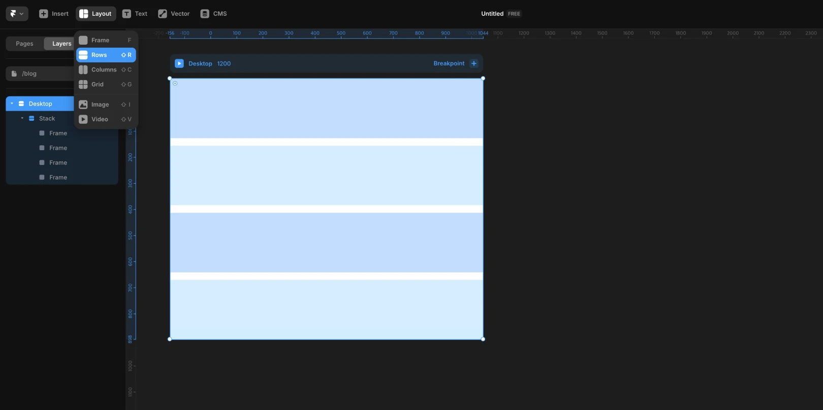
Create a Stack Frame from Scratch
Choose
RoworColumnfrom the toolbar and drag
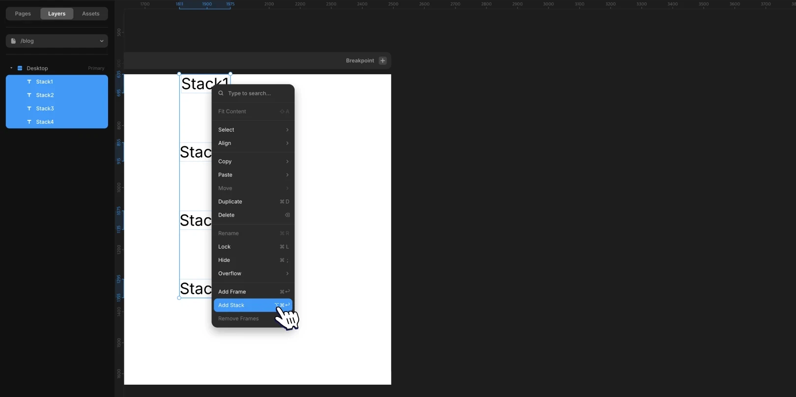
Group Existing Elements into a Stack
Select multiple elements, then
right-click > Add Stackor use shortcuts (Mac:Option + Cmd + Return, Windows:Ctrl + Alt + Enter)
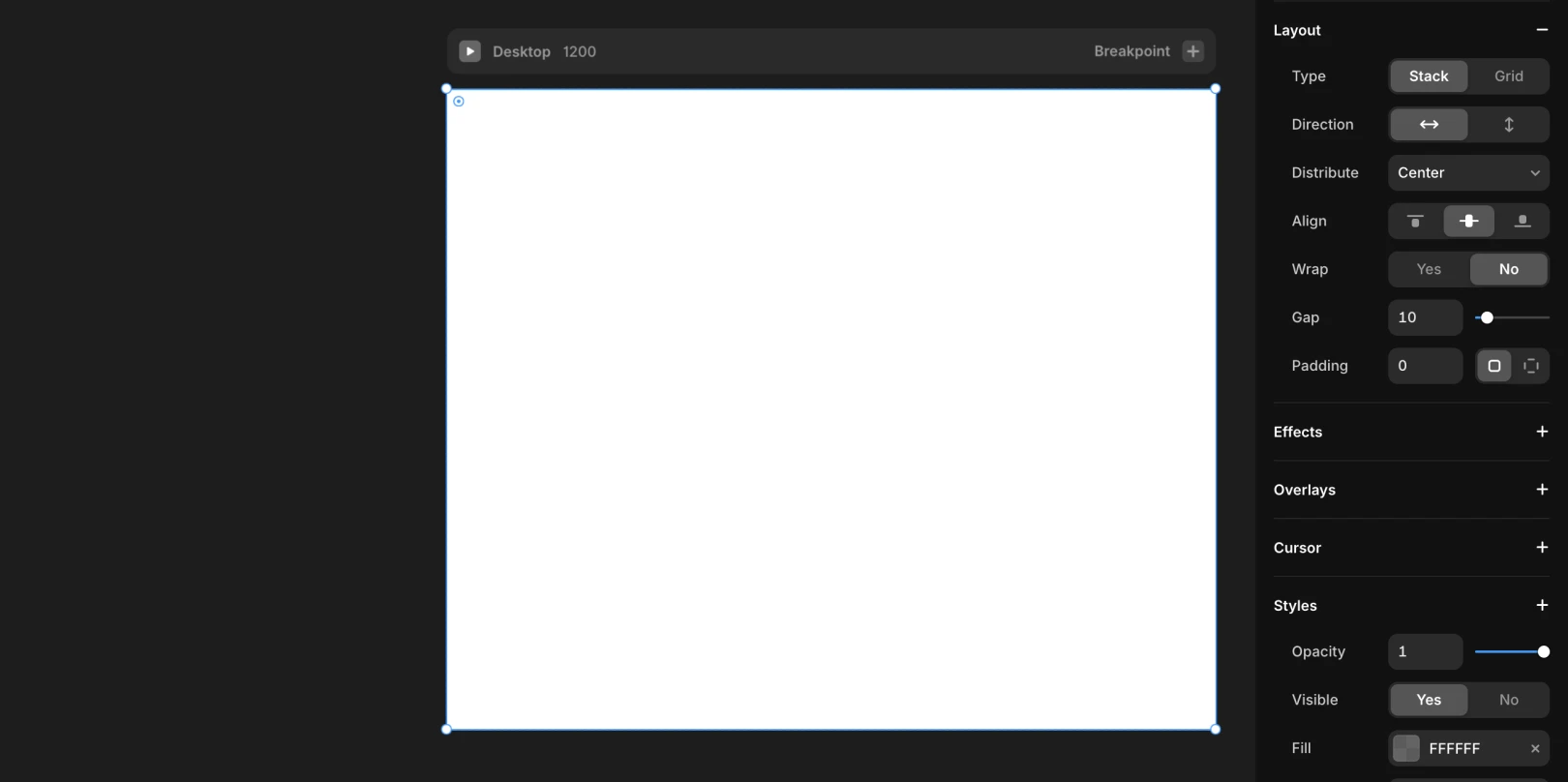
Exploring Stack Properties
Property | Description |
|---|---|
Direction | Horizontal / Vertical alignment |
Distribute | Automatically adjusts space at the start, middle, or end, or between elements |
Align | Aligns based on a vertical reference ( |
Gap | Sets distance between elements, adjustable by dragging |
Padding | Specifies the inner margins of the Stack (individually adjustable for all four sides) |
Automatically Adjusting Stack to Fit Child Elements
Use Shift + A or right-click > Fit Content to automatically adjust the Stack frame to the size of its child elements.
Stack Usage Examples
Navigation Bar: Logo + Menu (Horizontal Stack)
Card Component: Image + Text + Button (Vertical Stack)
Button Composition: Width automatically adjusts to text length (
Fit Content)
Responsive Layout Configuration is Possible
Applying Stack to the entire page makes structural changes easy per breakpoint.
By configuring sections like Header, Body, and Footer as Stacks for easier management, it's straightforward to adjust alignment or spacing.
This article is an adapted translation of Framer's official document 'Stacks and Relative Positioning in Framer'.
More posts


