Read Time
min
Design
Aug 29, 2025
Learn about the tooltip component
Tooltips appear when you hover over a button or icon, providing concise information to help users. This allows users to intuitively understand features and maintain a clean UI, improving the user experience.


Contents
Table of Contents
What is a Tooltip?
A Tooltip is an explanatory text that appears in a small window when you hover over or click on certain UI elements, like buttons, icons, or links. It helps users better understand the interface by providing additional context or help. For instance, when you hover over an unfamiliar icon, a short phrase explaining its function appears, which is a typical example of a tooltip.
When explaining the function of a button
When clarifying the meaning of an icon
When providing additional information to the user
In essence, tooltips are a device that can convey information at the necessary moment without making the screen cluttered, as in the three situations mentioned above.
Using in Projects
In this tutorial, we will look at how to create a simple tooltip component that you can use directly in your next project. View effects and remix the project >
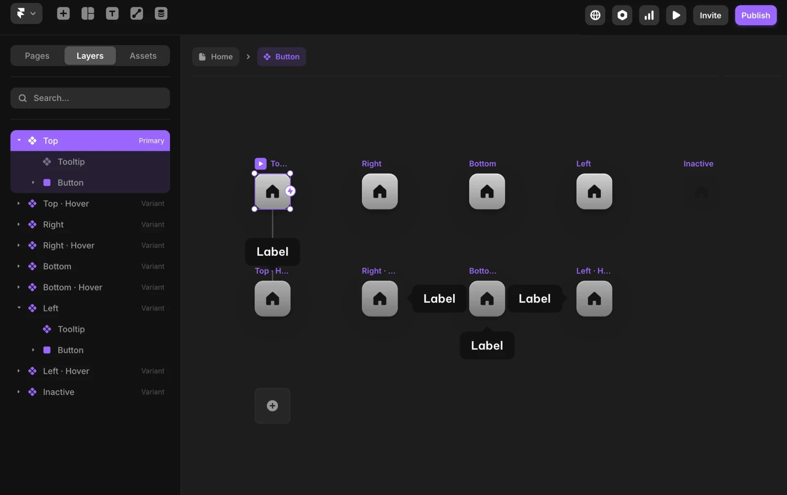
Linking tooltips to buttons
Providing additional explanations for icons
Exposing hints for specific functions
When tooltips are applied in this way, the user experience becomes much smoother, and the overall completeness of the service improves. In what situation would you most often like to use tooltips? Try remixing the project to create your own tooltips.
This article is a translation and adaptation of the Framer official blog’s 'A simple tooltip component for your next project'.
More posts


