Read Time
min
Problem / Issue
Nov 3, 2025
Why the Framer site doesn't fill the screen on mobile
The reason the mobile view doesn't fill the screen on the Framer site is due to element width settings being wider than the viewport. To resolve this, change the fixed width to relative units, adjust the Max Width, and then publish the changes to achieve a consistent full-screen appearance.


Contents
Table of Contents
Why isn't my site's mobile width filling the screen?
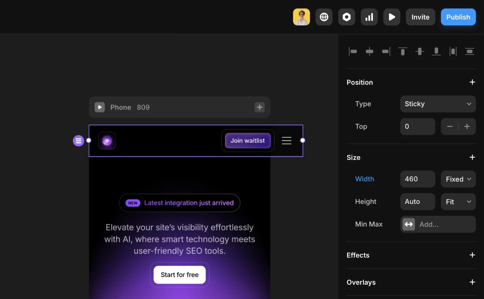
If a site created with Framer isn't filling the full width of a mobile screen at the breakpoint, the most common cause is elements on the page having a width setting wider than the viewport. This issue can be easily resolved by adjusting the width settings.
1. Identifying Problematic Elements
First, identify parts of the site that overflow or have extra space on a mobile screen. Such settings prevent elements from shrinking properly on smaller screens, causing the site to display wider than the screen.
Elements with the following settings often cause this issue:
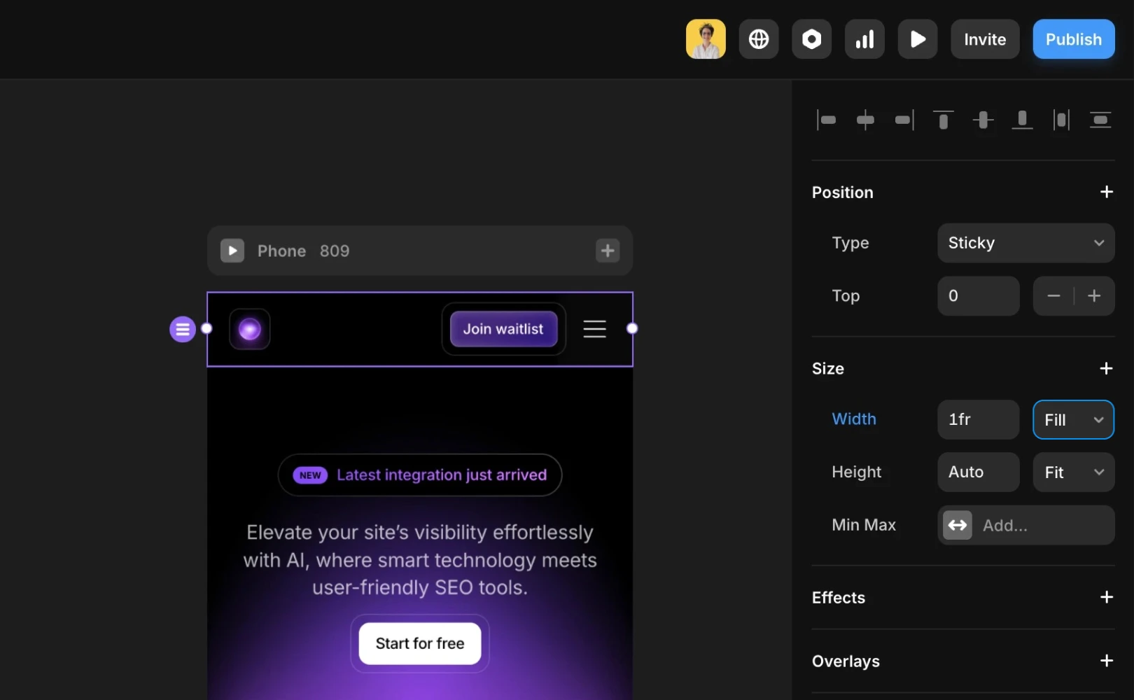
Elements set with a fixed width (e.g., Fixed / 460px) instead of a responsive width (e.g., Fill / 1fr or Relative 100%).
Elements with a
Max Widthvalue applied that is too large for a mobile screen.
2. Adjusting Width Settings
Once you've identified the problematic elements, modify the width settings as follows:
Change fixed width to relative units
Switch frompxunits to100%or1fr, so it adjusts automatically according to the screen size.Adjust Max Width
If the value set is larger than a mobile viewport, remove it or lower it to an appropriate value.
3. Apply Changes and Republish
After modifying the settings, you'll need to republish the site. Click the “Publish” button to apply the changes. You should then see the site filling the full width of the screen on mobile devices.
If you still encounter issues after following these steps, you can get additional help through the Contact Page.
This article is translated and adapted from the Framer official blog's article 'Why is my site not filling the screen on the Phone breakpoint?'.
More posts
Read More Blog

Problem / Issue
Dec 26, 2025
Increase your workflow speed in Framer using keyboard shortcuts

Problem / Issue
Dec 26, 2025
Understanding Framer's Reduced Motion Settings

Problem / Issue
Dec 26, 2025
Utilize text styles and semantic tags on your website

Problem / Issue
Dec 26, 2025