Read Time
min
Design
Jul 8, 2025
Setting responsive text style breakpoints in Framer
Setting text style breakpoints in Framer can enhance readability across different devices and maintain design consistency. It also allows for easy implementation of responsive UI.


Contents
Table of Contents
What are Text Style Breakpoints?
To ensure a website looks good on various devices, the font size and spacing should adjust according to screen size. Framer offers a very simple way to set this up: Text Style Breakpoints.
How to Create Text Style Breakpoints
Open the
Assetstab on the left and navigate to theStylessectionSelect the desired text style (e.g.,
H1,Body M, etc.)Click the
Add Breakpointsbutton under the Edit Style modal in theBreakpointssection
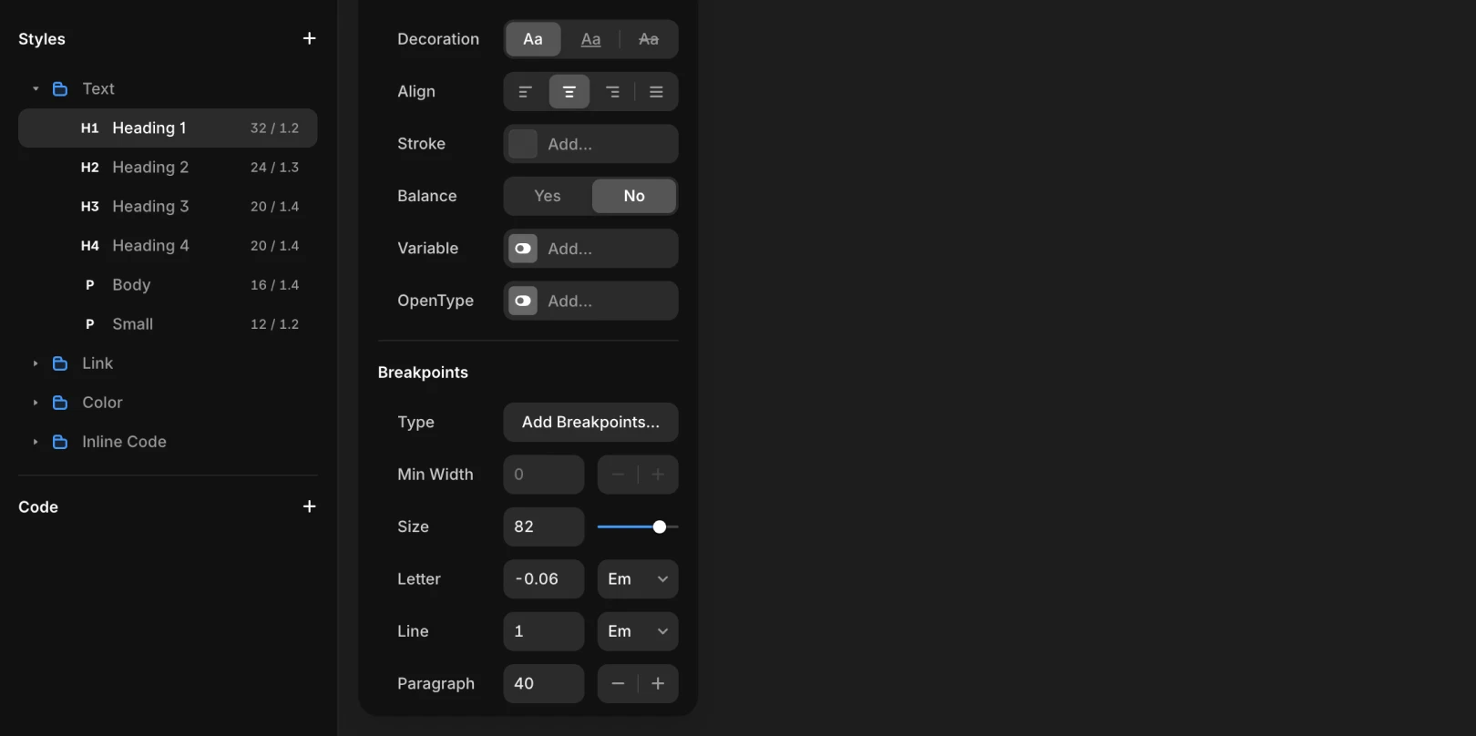
Three Breakpoints Provided by Default
Desktop (L)Min width: 1200Tablet (M)Min width: 810Mobile (S)
Attributes of Breakpoints
Font SizeLine HeightLetter SpacingParagraph Spacing
Note: You can adjust attributes for each breakpoint, allowing you to set the size of H1 to 56px on desktop, and reduce it to 32px on mobile.
Why Is This Feature Important?
Text is one of the most frequently used elements in design. Since text can lose readability or become too large, causing layout issues depending on screen size, it's crucial to set appropriate breakpoints for screen sizes.
Advantages of Setting Breakpoints
Automatically adjust
font sizeto match responsive UIMaintain
consistent styleas pre-designed by the designer
This article is an adapted translation of the Framer official documentation ‘Setting Text Styles breakpoints’.
More posts


