Read Time
min
Design
Jul 9, 2025
Framer Preview: Checking Responsive Layout
Here's how to run a site preview in Framer and how to check responsive layouts. You can adjust the viewport to see how the page looks on different devices, and custom code can be verified after actual deployment.


Contents
Table of Contents
How to Run the Preview
Click the
Play buttonat the top left of the page (frame).Or use the keyboard shortcuts
macOS:
⌘ + PWindows:
Ctrl + P
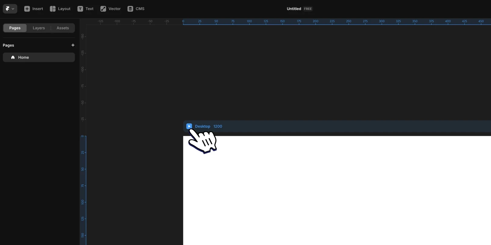
To close the preview screen, press the ESC key or click the close button in the upper right corner.
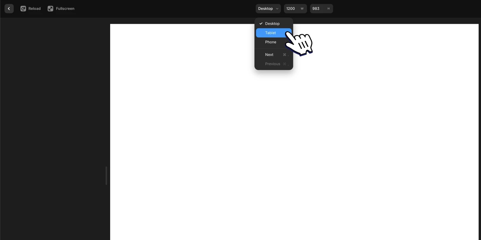
Check Responsive Layout
In preview mode, you can freely adjust the viewport size. This allows you to check page previews at different breakpoints directly.
Want to preview based on a specific device or breakpoint?
Click the viewport control button at the top center in preview mode.
Select your desired device size or breakpoint from the drop-down menu that appears.
For example, selecting Tablet will automatically adjust the screen to fit a tablet environment, allowing you to check its operation at that size.
Note: Custom code added in Settings does not apply in the preview screen. It can only be checked after the site is actually deployed.
This article is an adapted translation of the Framer official document, Previewing your Site.
More posts


