Design
Dec 24, 2025
Understanding Contrast Ratios for Website Design
In website design, contrast ratio is a key factor in enhancing user accessibility. It’s important to maintain a ratio of at least 4.5:1 for regular text, and 3:1 for large text, while adhering to WCAG guidelines.

Uploaded by

Translated by

Contents
Table of Contents
What is Contrast Ratio?
Using Framer, you can design your website and the experience of its users. However, before launching the site, it is recommended to ensure that the contrast ratio meets web accessibility standards.
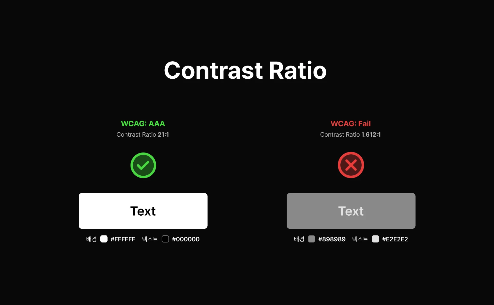
Contrast ratio measures the difference in brightness between two colors, typically between the foreground (text or graphics) and the background. This ratio is measured on a scale from 1:1 to 21:1, with higher numbers indicating greater contrast. Adequate contrast ratio ensures the readability and visibility of content, which is especially crucial for users with visual impairments, color blindness, or other cognitive difficulties.
WCAG Guidelines on Contrast Ratio
The Web Content Accessibility Guidelines (WCAG) provide specific recommendations for contrast ratios to support high accessibility in digital experiences.
According to WCAG 2.1, the following minimum contrast ratios are required to comply with Level AA standards:
Regular text: minimum 4.5:1
Large text (18pt and above or 14pt bold): minimum 3:1
Check the contrast ratio using one of the contrast checker tools below before publishing your website.
Understanding WCAG Accessibility
WCAG divides web accessibility guidelines into three levels (Level A, AA, AAA). These levels represent the strength of the criteria ensuring content accessibility. Make sure to determine which level is appropriate when designing with Framer.
The Three Levels of WCAG Accessibility
Level A: Meets basic accessibility requirements, such as providing alt text for images.
Level AA: A standard most digital services aim for, accessible to the majority. Important contrast ratios (4.5:1 for body text, 3:1 for large text) fall under Level AA standards.
Level AAA: Provides extremely strict standards so all users can access the content, like offering sign language for videos or setting body text contrast ratios to a high 7:1. This level may be challenging to apply universally.
Key Criteria of Level AA
Among various aspects of web accessibility, the contrast ratio is crucial for ensuring users can easily read the content. Examine the Level AA guidelines specifically considering most users.
Body text contrast ratio: The contrast ratio between text and background must be at least 4.5:1 to secure readability of typical text.
Large text contrast ratio: The contrast ratio between text and background must be at least 3:1. For large text (18pt or larger, or 14pt bold or larger), this standard ensures sufficient readability due to size, even if contrast is less critical.
Adhering to these contrast ratio standards enhances visual accessibility, allowing a broader user base to easily read your content. Meet these standards to offer your users increased accessibility.
Frequently Asked Questions (FAQ)
Q. Does Framer have a built-in feature for automatic contrast ratio checking?
No. Framer itself does not have a real-time contrast ratio checker built-in. Although primarily focused on design and website building, Framer recommends using external tools like WebAIM Contrast Checker to verify color palettes and text combinations.
Q. Is a website better if it meets Level AAA standards?
Yes, Level AAA provides the highest accessibility standards, but these are very stringent and can significantly restrict website design or specific feature implementation. Therefore, aiming for Level AA is generally the standard.
Q. Should contrast ratio standards be applied to elements like logos or images in Framer?
No. Contrast ratio standards are primarily designed to ensure text readability. If non-textual elements are not meant to convey information, it is not necessary to apply contrast ratio standards to them.
This article is an adapted and translated content from Framer's official blog post ‘Understanding contrast ratio.’


